
We know that homeownership is a path toward stability and building wealth, so how can we provide renters with concrete ways to think about owning? How can we connect renters with innovative resources that make the prospect of ownership more possible? How can we give current renters the confidence to pursue a path to homeownership? There is a LOT of information on the web, and a lot of information specific to Baltimore, especially given the city’s unique socioeconomic context and the impact of generational wealth disparity and institutional racism. If I were a renter–someone who was working full time, maybe with a child–I imagined I would have a hard time finding simple, accessible information that gave me a sense of possibility in one place. I wanted to fill that niche for renters in a specific geographic location: Baltimore City and its neighborhoods. My ultimate goal with this project would be to create individual print posters for display in community organizations–churches, cultural centers, advocacy organizations, and so on–focusing on specific CSAs, though it also has an interactive Tableau dashboard to facilitate online exploration.

I used data from Baltimore Neighborhood Indicators Alliance focusing on renters vs homeowners, vacancy rates, median income, tax incentives, and home sale price. However, I also knew that the CSAs were quite large and diverse–so I pulled in census tract data for the city and HUD location affordability data to complement the BNIA indicators. The HUD data took a long time to understand, clean, organize, and join/union, and while I ultimately did not end up using their “housing + transportation” model, I did draw on their basic gross rent and selected monthly mortgage costs, which were not available in BNIA. In a future version of this, I would include a map that used the HUD data models for different household profiles (median income, single working parent, retired couple, single professional, etc.). In the end, I focused on the dollars of rent vs mortgage at the level of census tract and CSA, with the added contexts of tax credits, vacancy rates, and rent affordability (those paying more than a third of income on rent), empowering the renter to see a landscape that may be otherwise invisible, given their individual forests.

Doing research, I learned about the “price-to-rent” ratio, which is a simple calculation expressing the relationship between home price and annual rent. It is frequently used in property investment to get a sense of where an investor might buy. How might it be used to provide a metric for renters, instead? At 15 or below, it is generally considered a buyer’s market, and profitable to purchase. Research also informed me that rents have been increasing in Baltimore–all over the city–which is really squeezing those who rent, and especially those renting with vouchers. Baltimore actually has the lowest price-to-rent in the entire nation, and many neighborhoods have PTRs in the range of 6-8. Often, these are historically depressed neighborhoods with very low annual income–usually Black. But, I wanted to think of a way to represent the neighborhoods that got away from the “butterfly” image–how to inject a bit of defamiliarization that might help us think differently?

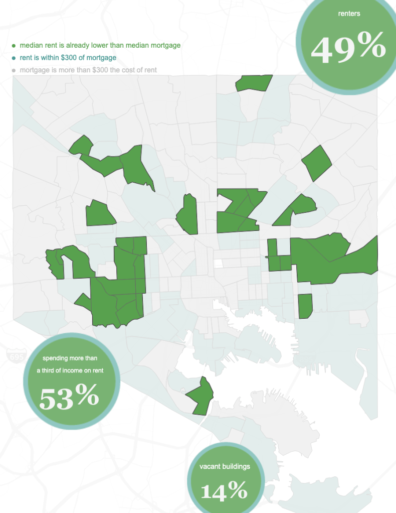
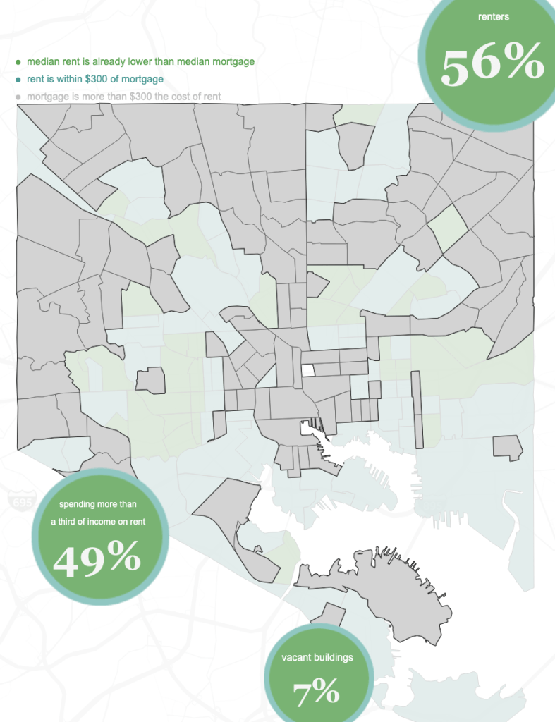
As a renter and an owner myself, I think of owning in terms of how much it costs each month to rent. So, I created some basic calculations that allowed me to test whether renting was cheaper than owning; within $300 of owning; or over $300. This seemed like a concrete, real world approach to the issue, especially since I want this information to get into the hands of community members–those who are renting, but with deep ties to their neighborhoods. These census tracts, linked to CSAs, are grouped by color, deprioritizing the more expensive (over $300 difference) areas. However, this grouping revealed some interesting realities.
One really curious thing I discovered was that in highly depressed areas, with very low median income, the price-to-rent ratio is small, but people are still paying very high prices to rent–note all the gray areas in the map in the center of the city, and those in Sandtown-Winchester, Upton, and so on. The highest percentage of renters paying more than a third of their income in rent is also currently living in areas where mortgages are less expensive than rents. Baltimore City has issued several white papers about the availability of affordable housing, noting that renters are disproportionately harmed. This gets at the central issue of how to buy when you’re just barely hanging on. I did not incorporate voucher use, but I would not be surprised to see a correlation here–higher voucher use in these areas boosting the cost of rent.

Challenges I faced in this project involved figuring out my audience, as I noted earlier, but also determining what to include and not include. I spent an inordinate amount of time trying to understand the HUD location affordability data, and I’m glad I took that time, but that was a big challenge, as well. Finding a way to convey what I came to discover–that for many renters, buying may actually be more affordable on the ground than renting–without overloading the reader with data was tough, too, and I worry that I didn’t include enough of an “idea” here. Ultimately, I am happy with this project outcome and can see a lot of future directions for work!
