My institution is currently transitioning to Canvas from Blackboard (hallelujah), and I've been taking the opportunity to dig into the Canvas api. Fun times! But first things first--what kinds of things does Canvas keep track of? What can we ask of it?
Retheorizing the Open Textbook Platform (Open Education 2024)
Last week, I attended the 2024 Open Education conference, and presented current work on the need to rethink the way we understand open textbooks. Almost a decade ago, Robin deRosa--an inspiration in open education--called for a retheorization of the open textbook, and I agree with her deeply. She writes: Fundamentally, I don’t want to be …
Continue reading "Retheorizing the Open Textbook Platform (Open Education 2024)"
#DH2024
It's that time of year again! I'll be co-presenting with colleagues at DH2024, the flagship conference of the international Association of Digital Humanities Organizations (ADHO). This year, the conference will be held at George Mason University, in partnership with the Roy Rosensweig Center for History and New Media (of ye olde THATCamp fame). John O'Brien, …
Storyboarding a Vyond video
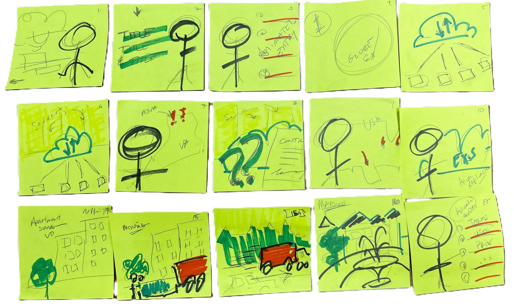
I'm frequently called upon to create engaging, animated educational videos from PowerPoint lectures--we use Vyond to do this, because it helps create a coherent look and feel, and it comes with a host of pre-created scenes, props, and characters, which makes the process simpler and more efficient. Sometimes I go into a previously-created Vyond video …
Process and product in instructional design
How do you manage your workflow when creating course components? What's your ethos? I've been thinking a lot about this recently, and I wanted to take some time to parse it all out in public. Let's look at an example! Recently, I've been working with subject-matter experts in cybersecurity and information management on a new …
Continue reading "Process and product in instructional design"
The politics of data and data viz for online course (re)design
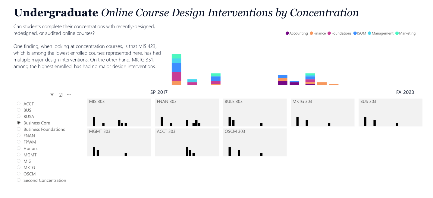
During the height of the COVID-19 pandemic, the abrupt turn to online education was necessary. We know it's changed our present landscape, as well. And as faculty members, we know that the politics of the pandemic shift to online education hit hard. How can data and data visualization help us see the people in the numbers? How can data humanism help us make better data-informed decisions around online course design? We need to track QA, design, and redesign interventions for online course design better. And we need to think hard about how the data we collect can be used to benefit our students in an era of AI, massive online courses, and courses that are created by equally massive for-profit conglomerates. Slow and small data may be a part of that. What do you think?
Student-centered ungraded activities in Bb
We want students to succeed in our classes, right? I’m pretty sure that’s right! So why do so many of us resist seeing our courses from the student’s perspective? Many faculty, especially those new, since the height of the pandemic, to teaching online don’t consider the work that the LMS can do to help keep …
Continue reading "Student-centered ungraded activities in Bb"
Telling the data story of post-COVID enrollment
Educators everywhere know that COVID-19 has proved a crucible for higher education, especially a higher education system beset by rising costs, facing a demographic cliff, and struggling with the brave new world of generative AI. Many institutions, even before the easy access to AI apps and technology, have already been sent into oblivion. Those who …
Continue reading "Telling the data story of post-COVID enrollment"
Project #1 in my new job!
As some of you might know, I recently took the plunge and left my tenure-track job teaching literature at a university whose name we shall not disclose. I took a new position as Instructional Designer and Technologist, dedicated to a specific school, at another institution. I was pretty worried about how this new chapter in …
Training Materials for Literature in Context
For folks interested in contributing materials to Literature in Context, a federally-funded "Slow DH" project that is also an OER, I thought it would be helpful to make these training materials available. Eventually, they'll be up on our site, but for the time being, I've assembled them here. This summer, John O'Brien (UVA) and I …
Continue reading "Training Materials for Literature in Context"


