
The questions of what stories we’re telling, who they benefit, and what principles they represent are important, as data viz designers better than I have long noted. Data humanism, an approach to data analysis and visualization put into words (and images) by Georgia Lupi, prioritizes the people that data represents, and everything impacted by that key principle–data quality, for instance, instead of just quantity. We are witnessing the dawn of an education revolution, characterized by increasing use of AI in teaching and learning, on the one hand, and courses courses that are created by massive for-profit conglomerates, on the other.
How can data humanism help us make better data-informed decisions around online course design?
During the height of the COVID-19 pandemic, the abrupt turn to online education was necessary. We know it’s changed our present landscape, as well. And as faculty members, we know that the politics of the pandemic shift to online education hit hard. How can data and data visualization help us see the people in the numbers? How can data humanism help us make better data-informed decisions around online course design?
Here’s an illustration of the change in class enrollments by modality from 2015 to 2023–at a large, 4-year public institution. This is not in a humanities context, but the implications are astonishing:
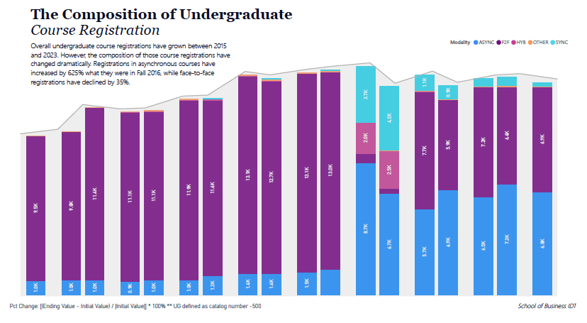
The impact of the pandemic is quite visible here, and it doesn’t look–at least in the most recent years–like the trend will change anytime soon. Just look at the dramatic difference between the predominant purple and sliver of blue before the pandemic, and how the proportions have evolved since. Here’s another visualization of the same thing:
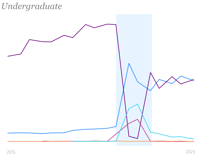
In the first image, we see total registrations in all courses as a line chart, which traces the stacked column chart. The dramatic shift in color composition of the columns is most attention-grabbing. Here in the second, we see perhaps more clearly the way that the early pandemic terms (noted in light blue shading), seem to have influenced the line trends. What is suggested in the column chart–that asynchronous and face-to-face modalities have become roughly equivalent–is explicit, in the second. But what’s missing from the second is the sense of how this impacts the overall trend in course registrations. In the first image, we note that total registrations is plateauing.
What does this mean for the people these numbers represent–the students, the faculty teaching these students, and the staff and administrators whose job it is to keep the lights on? And who do these numbers actually represent? What do we mean by “represent”?
Prior to the pandemic, faculty (we hope) were teaching how and as–in addition to what–they excelled, principally face-to-face. The students, those who participate in each of the courses offered by these same faculty in the different modalities, are getting an experience that is fundamentally different from that prior to the pandemic. What is driving this change? Is it coming principally from the students, who perhaps experienced online learning for the first time in 2021-2021 and decided, “This is right for me going forward”? Is it coming from the faculty, who might have also benefitted from the experience of working from home? Is it coming from those who schedule the courses? And if so, according to what logic? Online courses were available before the pandemic. Is it about cost? If so, that would mean that class sizes should be growing as well–and this is supported by other data. What is the composition of faculty teaching face-to-face vs online before and after the pandemic–full time or part time? Tenured or not? Teaching faculty or research faculty? Faculty who’ve taught online before, and are now doing it more often? Faculty who’ve only ever taught online during the pandemic, and are now continuing in that vein? How much training and professional development have they gone through to ensure the integrity of the experience for students? And is that quality assurance done regularly? I know that prior to the pandemic, at my former institution, who taught online and how the class was constructed were tightly regulated. The list of questions I have is endless. Well, maybe not endless, but pretty darn long.
Other data could help us respond to these questions. Data on class sizes, on faculty status and length of tenure, data on how and when courses are shepherded through a design, redesign, or audit process, and how these indicators might compare across the institution as well as beyond it, to peers and aspirants. But is anyone even tracking this data?
In my current position, we are attempting now to do just that–track course design, redesign, and audit interventions. But we’re learning that the process is ad hoc, and as a result, the data collection and categorization is inconsistent. And that tells us as much about the problem as anything else–if the data aren’t there, doesn’t that let the narrative take shape outside of these questions? We need to think about what’s missing as much as what’s present.
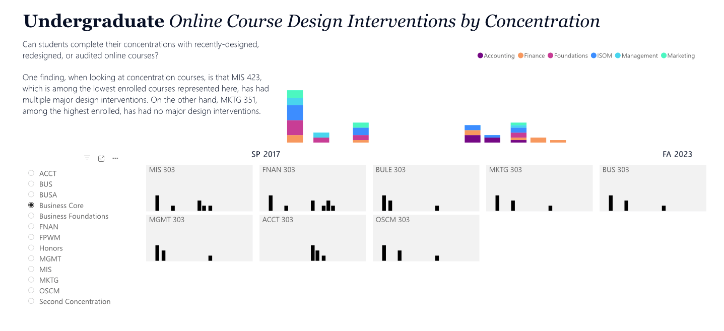
Take these graphical representations of hand-coded intervention data. This data has been kept by one person, whose position is focused on curriculum design & technology, by adding notes to a spreadsheet over time. The “interventions” or “touches” are specific times when a course was designed, redesigned, or audited in a focused, deliberate manner with programmatic or institutional support. We’re not including the work that faculty do every year to update their courses for current debates or new approaches.
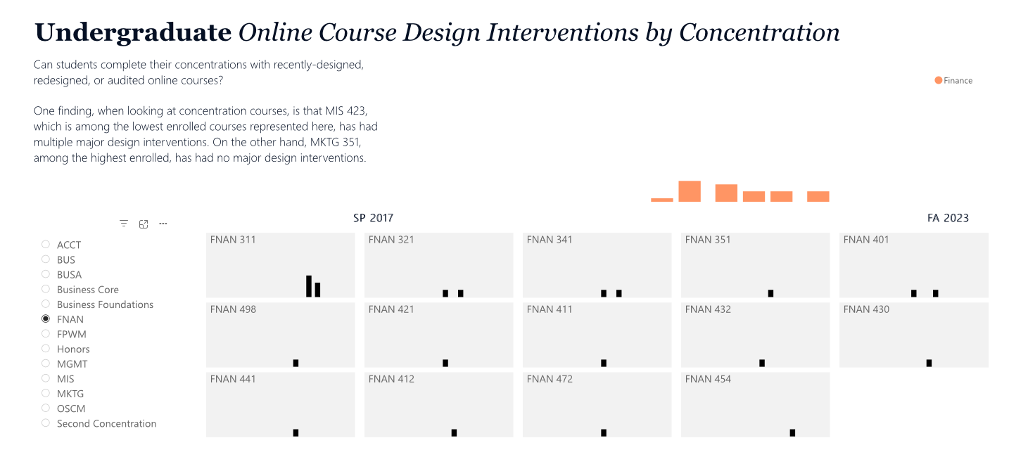
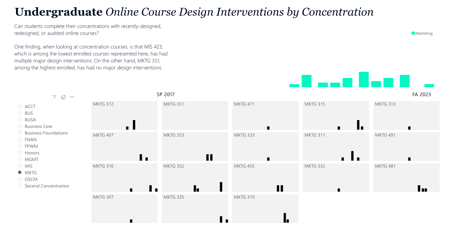
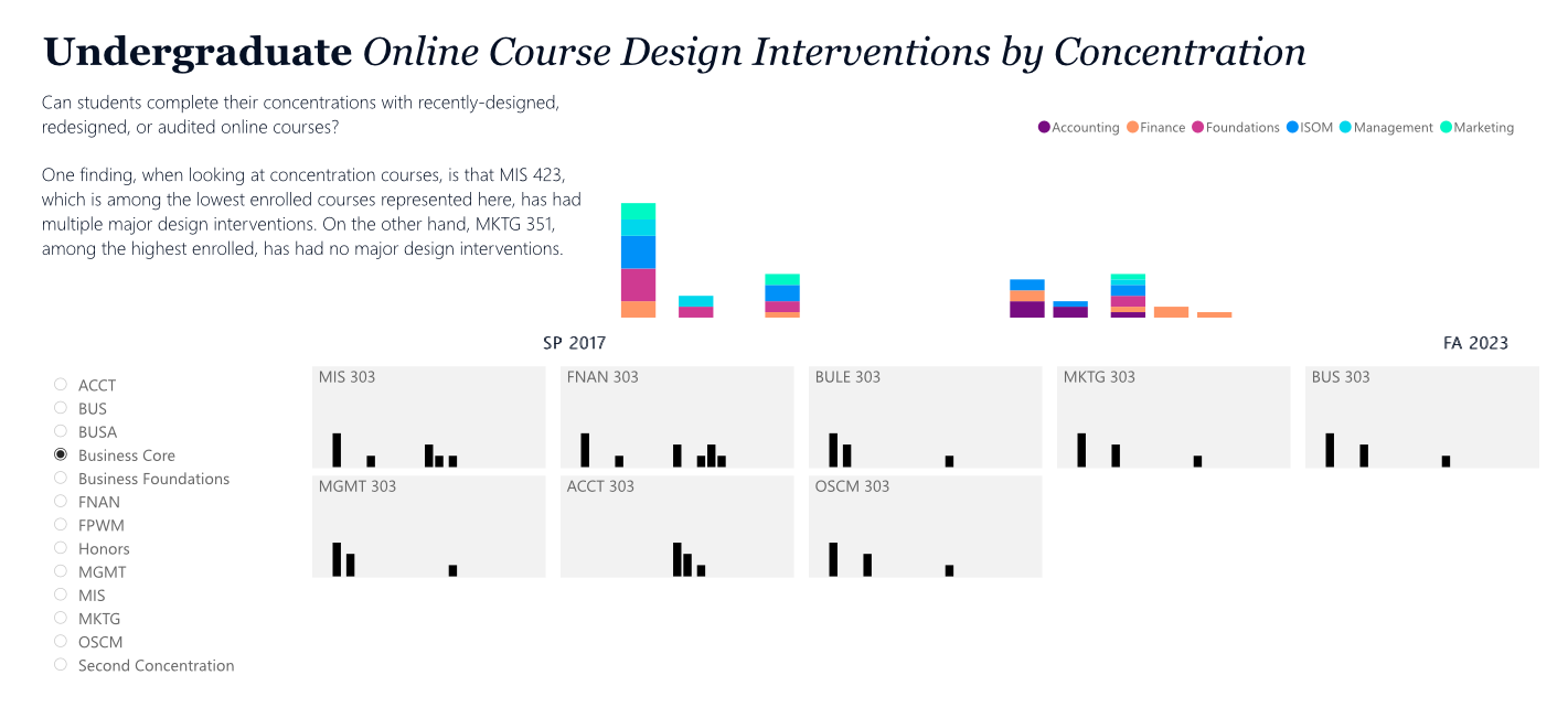
Each of these images visualizes the specific interventions of online courses, categorized by program concentration. The small multiples show individual courses, sorted by enrollment–high to low. One would expect, as we see in the case of Finance, that the higher enrolled courses would have more interventions. The small multiples are stacked columns, organized by time–from Spring 2017 to Fall 2023. The higher the stack, the more sponsored development/interventions the course has had, in that year. If no stack is visible, it had no intervention in that year. The stacked column chart in color at the top shows the same thing, aggregating for all courses in the concentration. Finance has had very little online course development, and all development began in 2020. A similar story, visible in the second image, is told for the Marketing program–with the visible exception of one highly enrolled course that has had, apparently, no intensive re/development. This shows an absence that perhaps we should rectify with a targeted approach to online course development and design.
Scrolling forward in the images to the composite core program viz, we can see that there is another Finance course that had earlier online development–but it is part of the core, not part of the Finance concentration per se. It probably double counts, which is something our data doesn’t show. In the core program, however, there has been much focused development of online courses, which suggests a larger programmatic approach to course delivery–here, there seems to be a demand prior to the pandemic. However, the interventions–important for quality assurance–drop off in 2021.
I don’t have an answer to how data can help us design better online experiences for students, but I do think we need to take the core principles of data humanism to heart. We need to track QA, design, and redesign interventions for online course design better. And we need to think hard about how the data we collect can be used to benefit our students in an era of AI, massive online courses, and courses that are created by equally massive for-profit conglomerates.
Slow and small data may be a part of that. What do you think?
