
Having lived in Baltimore for a few years, and having several friends involved in the creative industries there, I wanted to explore this aspect of the economy in my most recent Tableau dashboard. I used ten Baltimore Neighborhood Indicators Alliance data sets for arts-related businesses and employment, public art, median household income, demographics, unemployment rate, total employment by community, and the shape file for Baltimore city community statistical areas.[1]
This dashboard is useful for grant-seeking organizations in the creative economy, giving both an overview of the creative sector and a sense of some of the racial and wealth disparities that shape it. Because of the great disparities in wealth and unemployment throughout the city, I used neighborhood-specific data (though the BNIA does not aggregate at the neighborhood level, per se, but rather in 55 aggregate “community statistical areas”). I wanted to learn how businesses and employment in the creative sector differed across the city, and provide organizations an opportunity to see the contextual factors of race and wealth.
To create the dashboard, I cleaned my data sets in Tableau Prep by relabeling each yearly column of data by, simply, the year (i.e., instead of unemp10, I relabeled that 2010) and then pivoting the year columns into a single column titled for human usability (Unemployment Rate). I then joined the cleaned sets to each other using union (or “add”). I do have much more data in this extract file than I ended up using, which revealed that one can only union so many datasets. So, I ultimately had to union the unions. But that worked fine, and it resulted in a single extract file with fields for data like Unemployment Rate, % Employed in the Creative Sector, % Employed in the Arts, Median Household Income, % Black or African-American, % White (Non-Hispanic), Total Employed, Employed in Arts, Employed in Creative Sector, and so on. These fields had content for each year (many years were null, as the BNIA datasets were not consistent in terms of gathering for each year), which allowed me to put them all on a single timeline for my KPIs and other charts. BNIA also records Arts-Related and Creative Economy as separate datasets, which contain mutually exclusive data. I created table calculations that aggregated six fields into two (Number Employed in the Creative Sector and Businesses in the Creative Sector per 1000) and created a % Employed in Creative Sector (Number Employed in Creative Sector / Number of Total Employed). I also did additional research at the national level, which I used for context. To provide analysis, I incorporated reading I had done about the arts and the creative economy in Baltimore, especially around the establishment of the various official Arts and Entertainment Districts.
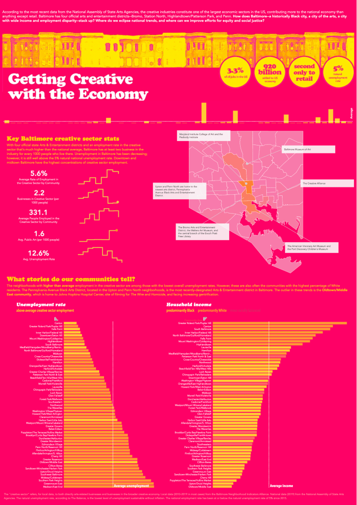
The KPIs I was most interested in were related to employment and businesses in the creative sector, as well as the density of public art. In the header, I incorporated in some key national KPIs (these are static images, not live data), to provide context that shows how above average Baltimore’s creative sector employment trends are. I decided to use averages for the data I had in the big numbers, to provide an overall sense of the stability of the arts in the city. It also helped me address missing years in the data. These KPIs were then disaggregated in sparklines to show volatility on a year-by-year basis, as well as where we were today (or rather, in 2019, the last year of data available in most cases. I would also consider the horizontal bar charts incorporated in the bottom half of the dashboard to be KPIs, as they represent where each neighborhood is vis-à-vis average city-wide unemployment rate and median household income. In addition, the vertical bar chart used as a divider beneath the header also shows high-performing neighborhoods in the area of creative sector employment. The average line and the horizontal layout of the chart dramatizes the intense disparities between neighborhoods, and the fact that most neighborhoods are well below average in this KPI.
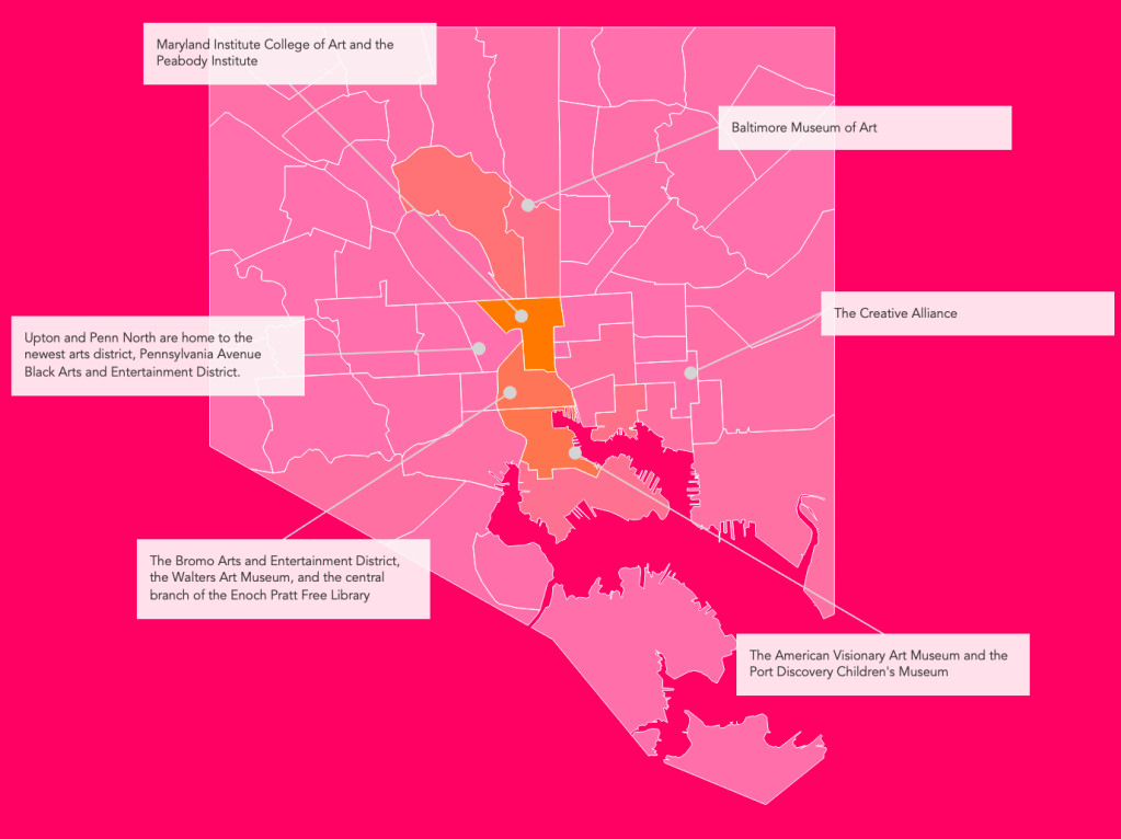
I chose the combination of map, bar charts, big numbers, and sparklines to help my overall goal cohere. They (should) selectively filter, so as not to create too much distracting movement, and the horizontal bar charts should, on hover, show the location of the relevant community in the map (for those not familiar with all the neighborhoods!). I wanted to use a map not only because we had such great geospatial data to work with, but also because as a city Baltimore is defined by its neighborhoods, where they are in relation to each other and the center of the city, and so on. The bar charts I found very useful because of the simplicity of their ability to show comparison between the neighborhoods (and for their simple graphic qualities). Like the bar charts, the graphic quality of the sparklines appealed to me and made sense for my data. They showed year-by-year difference very clearly, and I used the square line style in the sparklines to imitate the shape of Baltimore rowhomes and a city skyline, tying into my use of pre-attentive tributes.

Pre-attentive attributes like shape, color, and number were important as I began designing the dashboard. I chose typefaces and colors that read “Baltimore creativity” to me, and which somewhat echoed the MICA color scheme, as well as shapes like bar charts and square sparklines to resonate with the header image I created. I wanted the dashboard to suggest the arts—and Baltimore—immediately, as well put the reader in an energetic frame of mind. I was aware of possible dangers relating to readability, and while I am not entirely happy with the use of yellow, orange, and purple for the horizontal bar charts, I think they are legible at a quick glance, which is what I wanted in my KPI dashboard. I used the square line style in the sparklines to imitate the shape of Baltimore rowhomes and a city skyline, and I minimized the text, both in quantity and size, to encourage readers to be able to take in the whole and see relations more easily. I also reduced the number of columns in my lower bar charts for readability and simplicity; where at first, I had four or five columns for single measures, all in bright yellow, I realized this was difficult to read—and hard on the eyes. I incorporated the main KPIs and contextual issues as colors there, using a table calculation that tested for above or below average in arts employment, on the one hand, and predominantly white, black, or more racially mixed, on the other. These allowed me to condense the bar charts into two, instead of four or five, and make the color scheme less intense by adding a minimal number of additional colors to register the table calculations. The bright white dotted average lines on the bar charts are immediately visible, fulfilling both data-driven and aesthetic purposes. I had a difficult time with the map; I wanted to get rid of the backgrounds used with Open Street Map and tie it in seamlessly with the dashboard; I am very pleased with the ultimate result.
The mobile version of the dashboard closely hews to style and content of the desktop version, but to enhance readability I added more blank spaces, expanded the horizontal bar charts and placed them one above the other (instead of side-by-side). I removed the mark annotations on the mobile map, as well. The map of Baltimore is almost square, so I thought it worked well in mobile despite the size restrictions—I think the map actually works less effectively in typical desktop layouts because of this. The absence of a background makes the map more readable in mobile, too. I made a few changes to the graphics in the mobile version, like cropping the header and separating out the national statistics to place just the rowhouses at the top and just the national statistics at the bottom.
I spent a good amount of time on the tooltips, using the typically empty tooltips for the big numbers to drive home a key point: that while Baltimore’s city-wide unemployment rate is as a whole is more than double the current national natural unemployment rate, its citywide rate of employment in the creative sector is also almost double. I also created the table calculations used as filters in a way that also made my tooltips throughout more syntactically clear. For instance, in the bar chart on race and wealth, a tooltip reads, “In Downtown/Seton Hill, a more racially balanced community, the average household income is…”. If I had more time and knowledge, I would want to do parameter tests to alter the tooltips even further, so that at the citywide level, for instance, the tooltip (and the data) reads in relation to the whole city, rather than each community. (And in passing, I would also want to figure out why the end points on my sparklines aren’t all showing up!).
As I was putting this dashboard together, I noticed that Baltimore has a handful of neighborhoods that are head and shoulders above the vast majority in terms of employment in the creative sector. While the overall city average of employment in the arts is much higher than the national norm, only a few neighborhoods are driving this trend. Racial demographic information and data on household income suggests that presence of the arts is generally higher in wealthier, whiter neighborhoods with lower rates of unemployment. One outlying neighborhood, Oldtown/Middle East, is an interesting case. It is a predominantly Black community with the lowest average household income in the city ($16,062) and a high unemployment rate (18.8%); yet, without being a designated Arts and Entertainment District, it is one of the highest sites of creative sector employment. This area is home to the Johns Hopkins University medical center, the site of filming for The Wire, and is just north of the stretch of Baltimore Avenue that is heavily populated with adult entertainment venues. It is also one of the most quickly (and controversially[2]) gentrifying neighborhoods, and the arts are key harbingers of that process. There is only one Black Arts district, the newly formed (2019) Pennsylvania Avenue Black Arts District, located in Upton and Penn North (parts of two bordering community statistical areas).[3] This area, historically the center of Black arts and culture in Baltimore prior to the riots of 1968, is, like many other predominantly Black neighborhoods in the city, economically depressed. Hopefully, this recent designation will draw businesses and employees in the creative sector, changing unemployment and income trends while maintaining the Black character of the neighborhood.
Dashboard URL: https://public.tableau.com/app/profile/tonya.howe/viz/GettingCreativewiththeEconomy/GettingCreativewiththeEconomy
[1] Vital Signs datasets actively used in dashboard:
- Number of Employees in the Creative Economy – Community Statistical Area
- Total Employment in Arts-Related Businesses – Community Statistical Area
- Rate of Businesses in the Creative Economy per 1,000 Residents – Community Statistical Area
- Number of Businesses that are Arts-Related per 1,000 Residents – Community Statistical Area
- Public Art per 1,000 Residents – Community Statistical Area
- Median Household Income – Community Statistical Area
- Percent of Residents – White/Caucasian (Non-Hispanic) – Community Statistical Area
- Percent of Residents – Black/African-American (Non-Hispanic) – Community Statistical Area
- Unemployment Rate – Community Statistical Area
- Number of Total Jobs Filled by Employees – Community Statistical Area
- Community Statistical Areas (CSAs) Reference Boundaries
[2] “Gentrify or die? Inside a university’s controversial plan for Baltimore.” The Guardian, 18 April 2018. https://www.theguardian.com/cities/2018/apr/18/gentrify-or-die-inside-a-universitys-controversial-plan-for-baltimore
[3] “Black Arts & Black Power: Creating Baltimore’s Black Arts District.” Leaders of a Beautiful Struggle, 7 July 2018. https://www.lbsbaltimore.com/black-arts-black-power-creating-baltimores-black-arts-district/
