

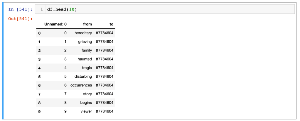
I spent the last few days trying to figure out parts of networkx, a python package for network diagramming–with some success! I had some old data from an earlier attempt at using networkx with tokened text from IMDB summaries and synopses. That code basically took each text chunk, tokened it out, dropped stopwords, and then created an edge list with individual words in the summary/synopsis as the source and ttconst as the target, like so:
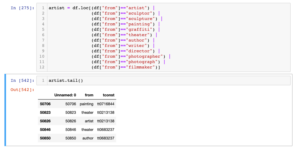
Previous attempts to use networkx with this full list–which has 50864 rows–was just unreadable, so I wanted to narrow it per my focus. I created a new dataframe excerpting just the rows with specific keywords in the “from” source column:
This gave me a column with all the keywords I was looking at connected to the tconst of the film they appeared in. (I had done some renaming of the to/tconst column throughout my work in Jupyter, hence the new column name. Turns out, it’s not necessary–you just need to specify the target column by name! That’s a relief. )
After playing with merging other datasets, renaming columns, dropping unnecessary columns, and so on, I realised that I needed to simplify. I ended up with a dataframe called “artist_edges_titles_ratings” with, in addition to a bunch of other info I didn’t use, contaiined two columns titled “from” and “primaryTitle.”
Learning that in networkx, you can pull directly from pandas dataframes, I created this network diagram. You’ll note the networkx method from_pandas_edgelist, which takes the dataframe, the source column name (“from”), and the target column name (“primaryTitle”). Figuring out sizing of the figure was a little challenging, and I also had to figure out that the labels are drawn from the column contents–which is why I didn’t use “tconst” but instead chose the column with the full title in it. This was pretty simple to do (google, again, is your friend)!

This looks pretty good! What you see here is the edge (connecting lines) between each node, where the nodes are the unique data in the edgelist. In the detail below, you’ll see, for instance, that the node “scupltor” is indistinguishable from the nodes “Scream, Pretty Peggy,” “Mill of the Stone Women,” or “Cauldron of Blood,” which are film titles. How to distinguish them? Why is this happening?
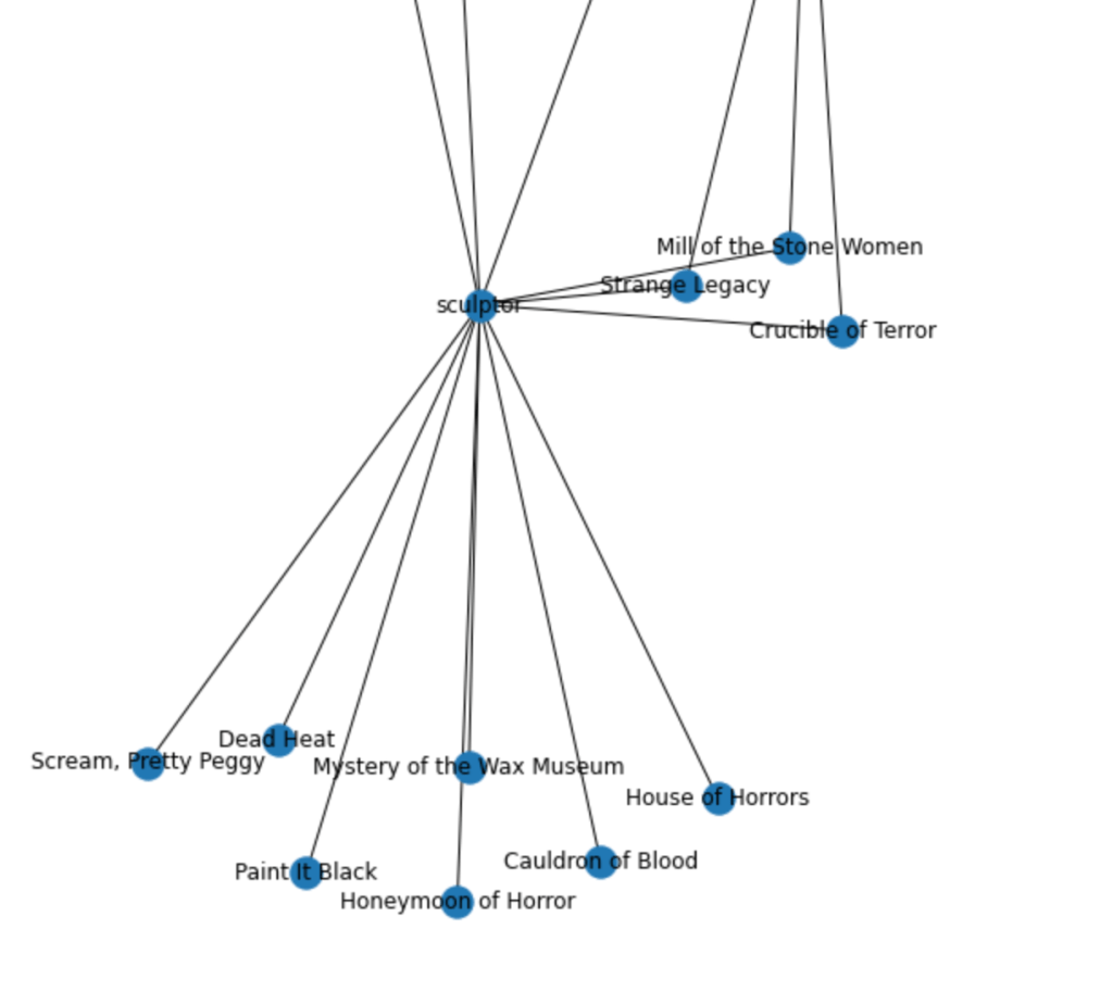
I spent a good amount of time on google and realized that (I think?) I needed to have a separate nodes list, with attributes for each node. This made the use of the from_pandas_edgelist method sort of obsolete, and I had to find another way to do it. Apparently, from_pandas_edgelist transforms all column data into nodes, and then draws connections from the source/target data. This makes it a quick way to put up a network diagram, but not good for distinguishing between your nodes. (If anyone out there knows how to format nodes easily while using from_pandas_edgelist, let me know!)
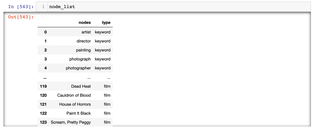
Wait, what exactly is a node list vs an edge list? A node list is basically a list (and it should be a list, which I’ll explore below) of all the unique pieces of information–so, all the keywords and the film titles need to be in a single list. That way, I could then indicate which were keywords and which were film titles. I was sort of expecting pandas or networkx to just make those distinctions, which they can’t do. So, I concatenated the title list and the source list (which in the original dataframe holds the keywords. This gave me a dataframe called node_list

This gave me a dataframe with an index (note, I had to use node_list.reset_index(inplace = True) to re-number the index consecutively) and a single column, and in that column, a list of all the unique data points in my dataset. I needed to add another column for the type attribute–this allowed me to distinguish between keywords and films. I sort of brute-forced this, but since I am looking at a small number of keywords, that wasn’t such a bad thing.
I first renamed the “from” column to “nodes,” and added a new column called “type” to which I added the data point “film” to all the cells. Then, I just found each of the datapoints that should be “keyword” instead of “film” and changed that data, like so:

I ended up with a dataframe called node_list and a dataframe called edge_list:
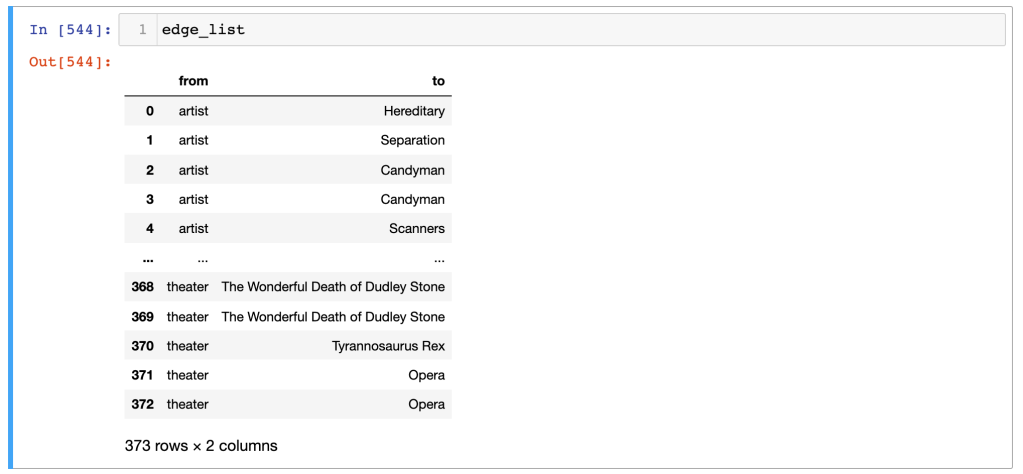
Note that there are only 123 nodes, and three times that in edges. This is what you should expect–your nodes are all the unique data points, and the edges are the connections between them. One keyword might be connected to multiple films–which is what I’m looking for.
Then, I had another bit of a setback, because these dataframes need to be turned into lists!! Argh. Here’s how to do that: list_from_df = df['column name'].values.tolist(). I also have to thank Jonathan Soma for his fantastic tutorial on creating network diagrams, which I cribbed from mercilessly. He showed both how to use the from_pandas_edgelist method and how to use a node list so more control could be asserted over the look and feel of the network. There have been some updates to networkx since 2017, which I make use of here:
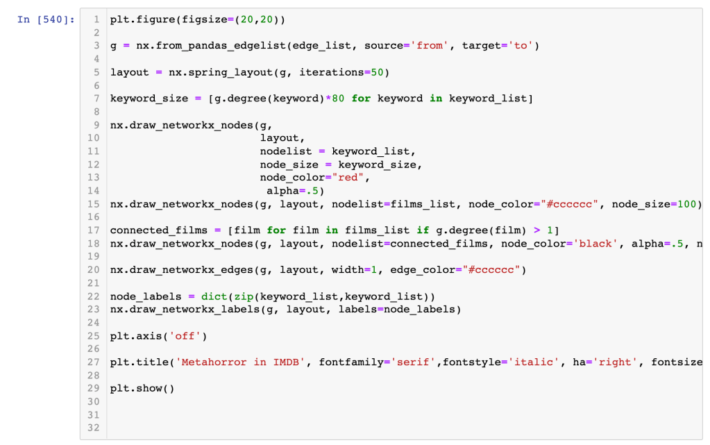
The “connected_films” iteration selects each film that has a degree of connectedness greater than one–that is, each film that contains more than one of the keywords I’m looking at. The “node_labels” iteration creates a dictionary list connecting the keywords to one another, honestly I’m not sure why this needs to happen that way. Then you draw all the nodes and edges and labels you need, turn the axis frame off to get rid of the border, give your network diagram a title, and show it! Here’s mine:
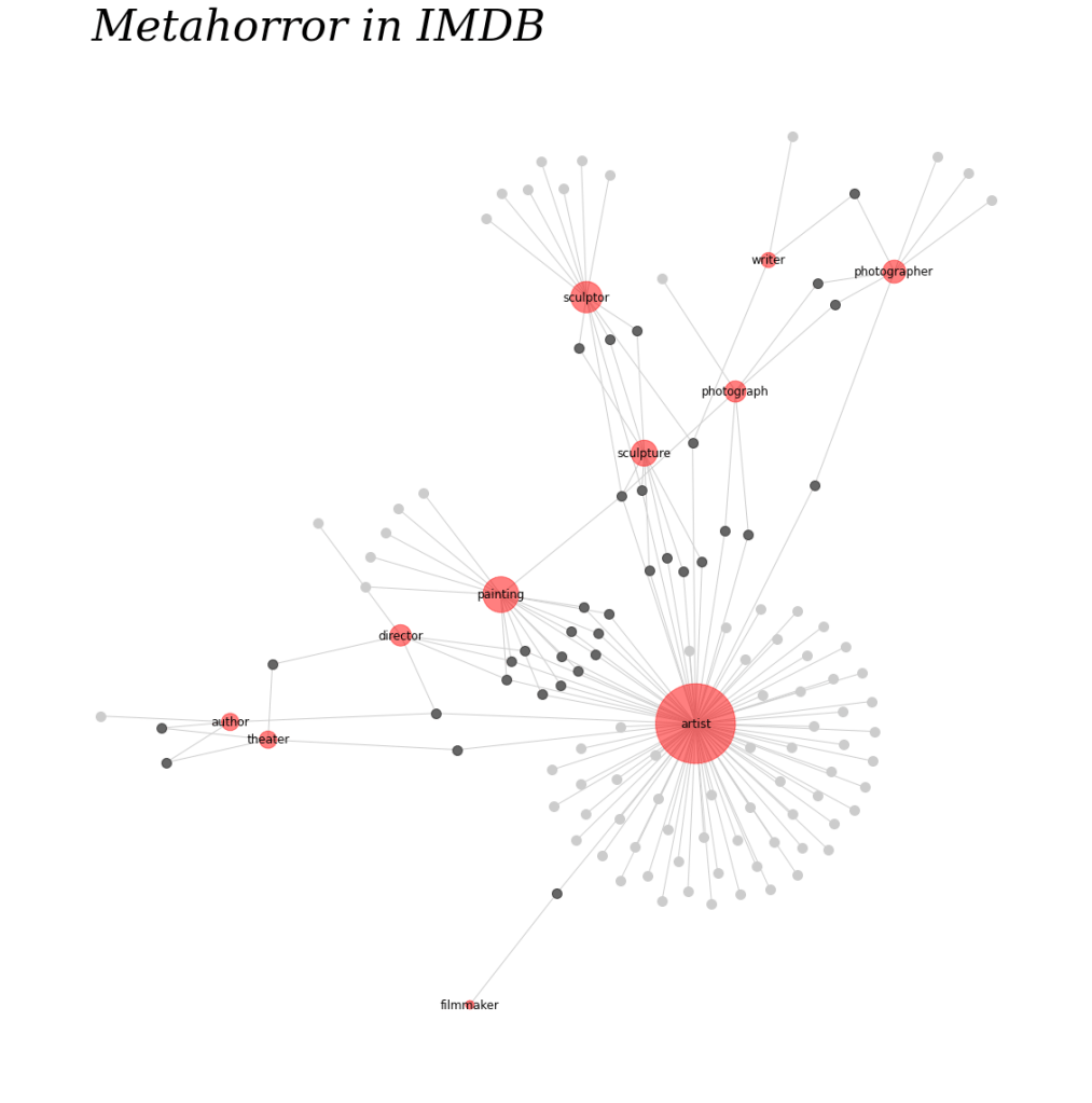
I do have to say I like the circular layout, too, which has a certain elegance about it:

I’ve still got a long way to go, but this is a promising start. The code community, slack, stack overflow, and many other sites have been invaluable, as has my brother-in-law Chafic Wanna and my python teacher Larry Gray!
